Discover how to change the order in which the columns of a WordPress block appear only on small screens with a little code.
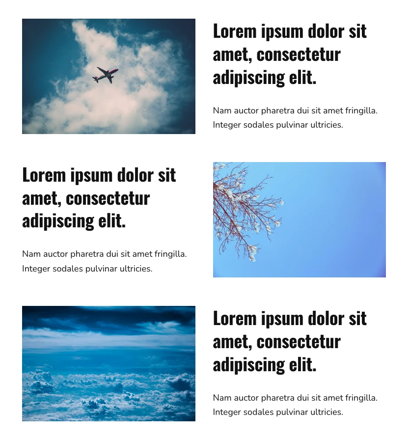
In desktop format, alternating blocks of columns that display an image on the left and right side each time, is usually a very popular design resource.
However, when the page is viewed from a mobile device, this format is not so visually attractive, since the image-text alternation is lost when the columns are stacked.

Have you ever encountered this problem?
Well, now you can solve it in a simple way with a few lines of CSS.
This is how the columns would behave on small screens:

Let’s see how:
Snippet to reverse column order on mobile devices
1. Create the column blocks
Create the column blocks and configure the settings to your liking to display image-text alternately on desktop.
When you have created them, group them in a group block.
2. Add a custom CSS class
Once you have created the group block, go to the “Advanced” section and add reverse-order-mobile in the block’s “Additional CSS class(es)”.

3. Create the CSS class
Then add the following snippet to the end of the style.css file.
To see this and another 1091 code snippets of this website, login or subscribe here.
In this code you modify the CSS of the even columns on devices with less than 660 pixels resolution, so that the order in which their columns are stacked is reversed.
And this is just an example of what you can achieve with a little CSS. If you are interested in any other variations I’m all ears.
Conclusions
You see how easy it is to change the order in which the columns of a WordPress block appear on small screens without affecting the desktop version.
If you have any question, please leave it in the comments. And if you want to give me a suggestion for future snippets, please send it through the contact form.
Benefits of being a subscriber. 🙂
